Redeemer Fellowship
BRAND IDENTITY
REDEEMER FELLOWSHIPNashville, Tennessee
A church for neighbors.
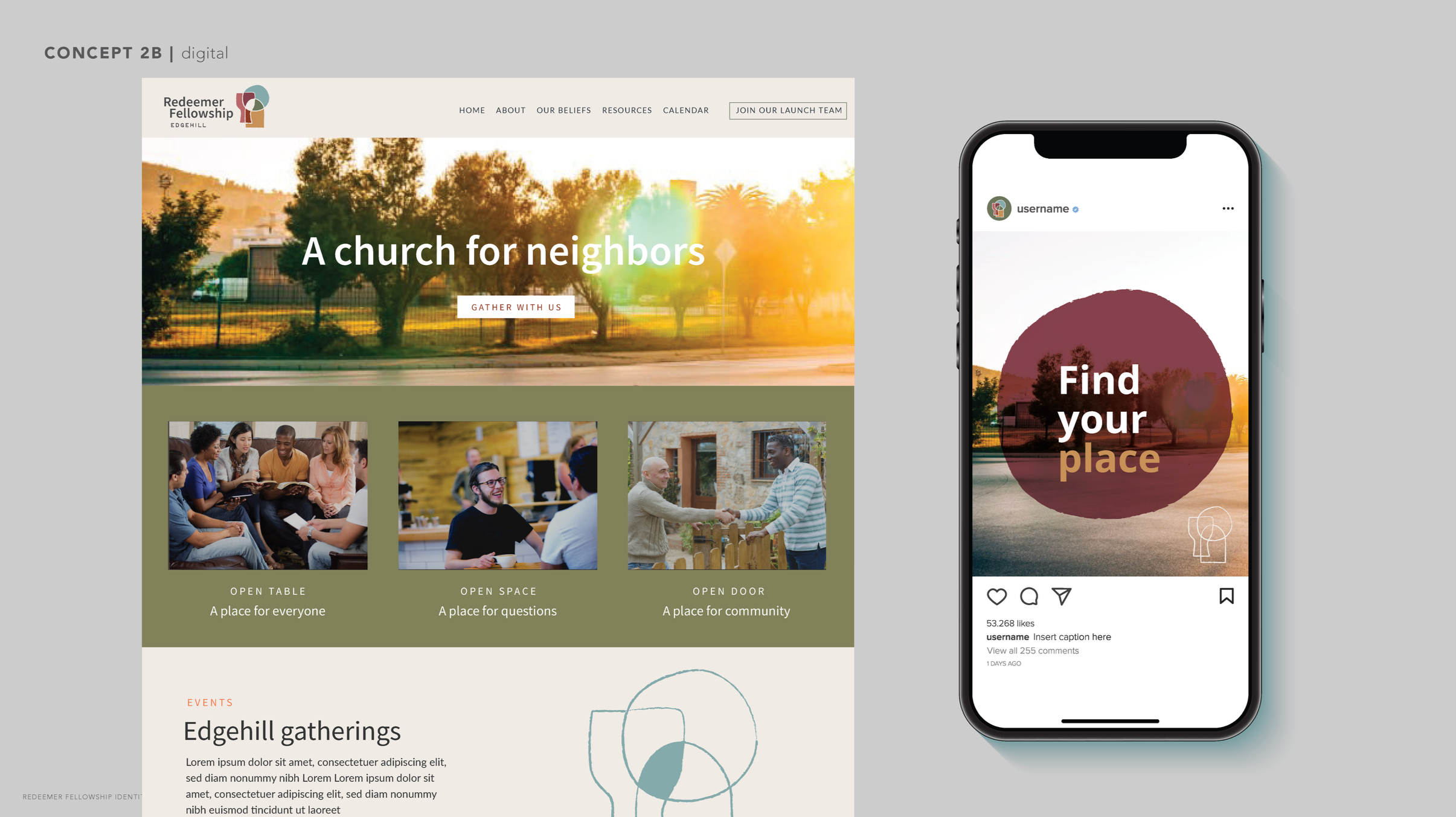
A city church being reborn as a neighborhood faith community in the heart of Edgehill was seeking a fresh identity and visual language to communicate their new vision and deep values to like-minded neighbors. Building on a deep exploration of their faith, their values, and their surroundings, we created a heartfelt mark and a welcoming visual identity that captures the feeling of being known.
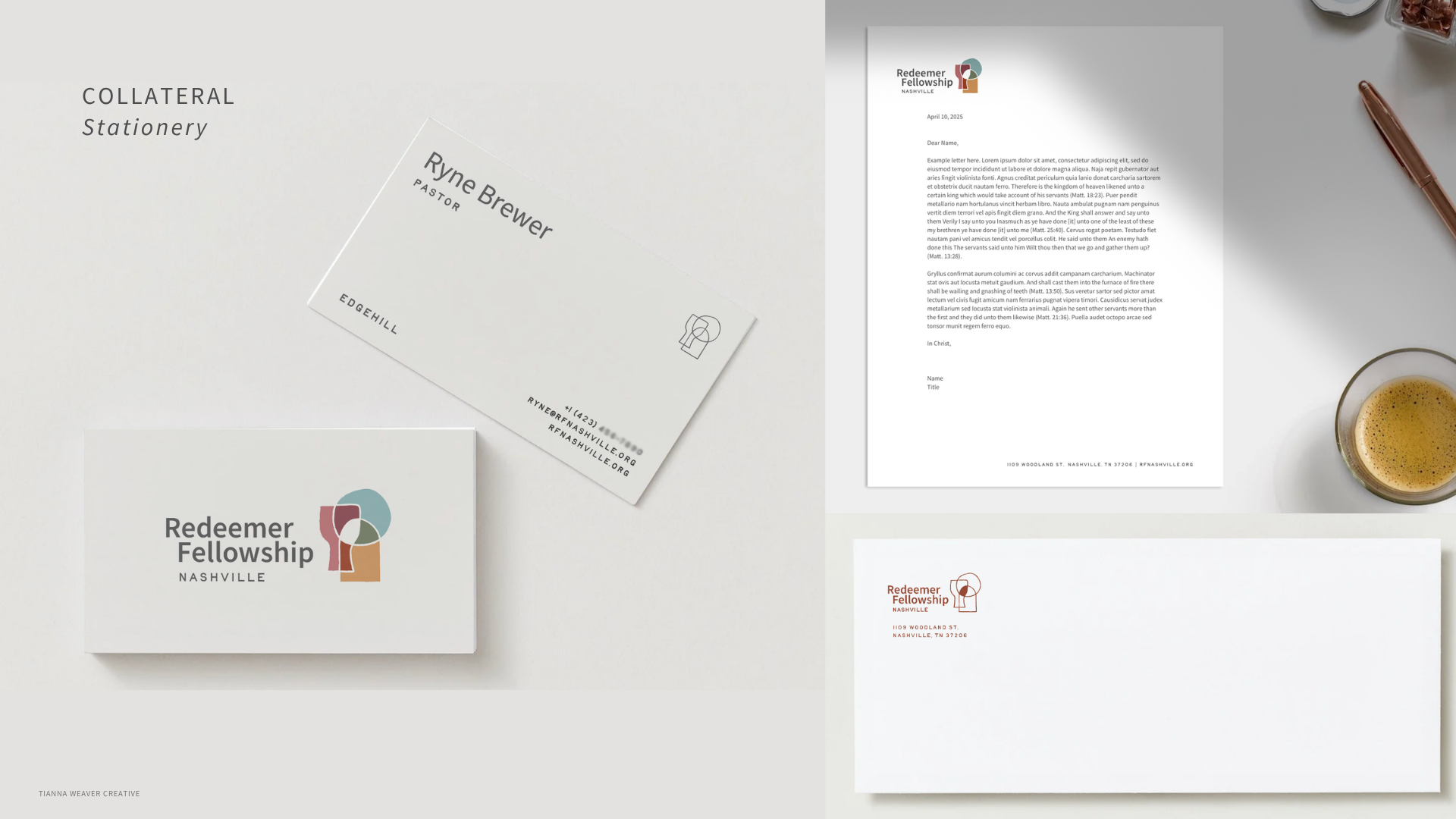
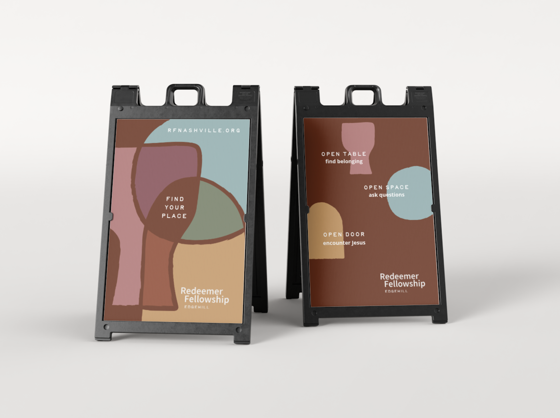
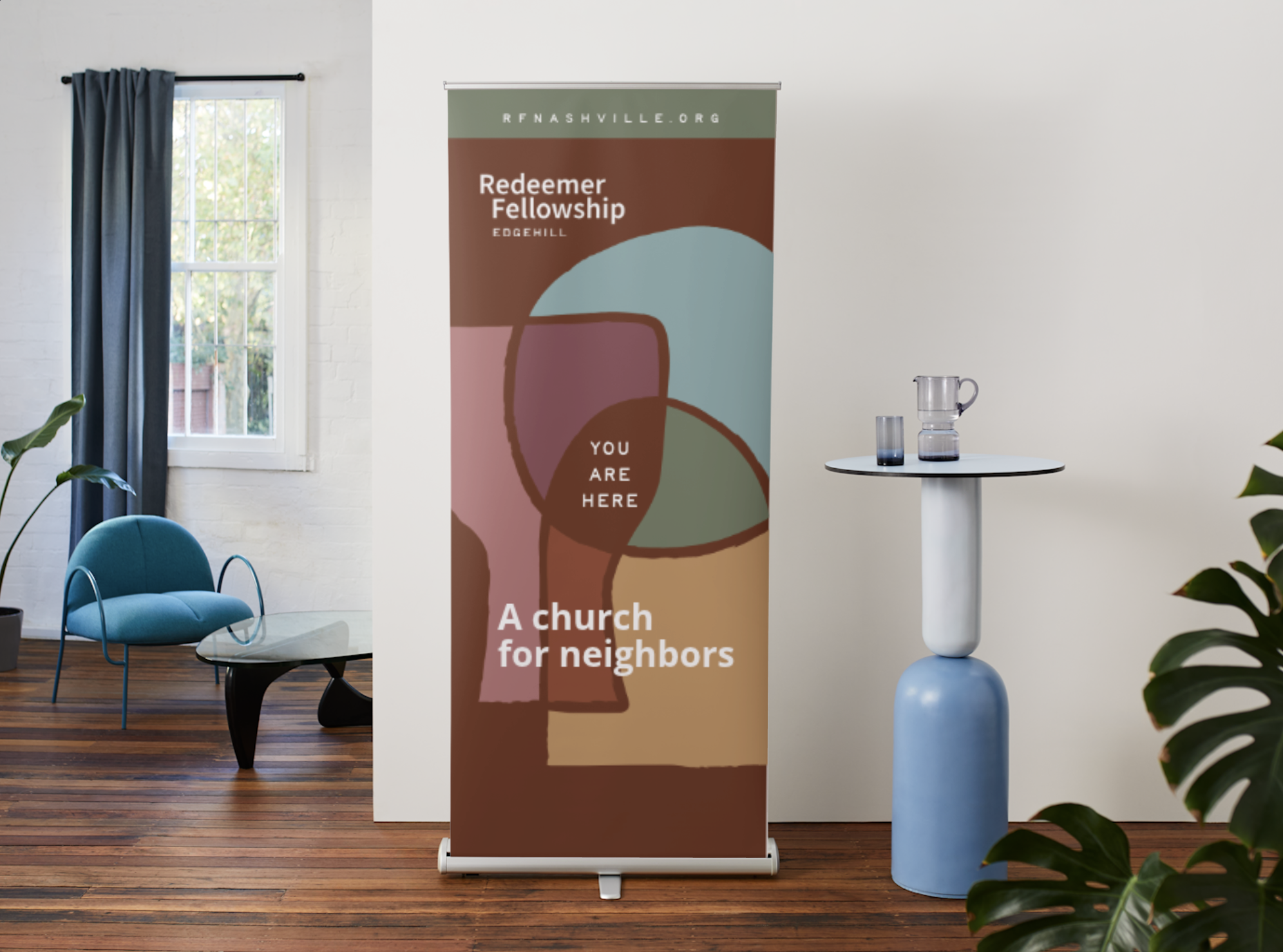
Brand Strategy, Logo development, brand guide, stationery, signage, social graphics
Familiar, Nurturing, Real
We dug deep into their growing vision, values, and roots to uncover meaningful symbolism that would feel like a fresh, welcoming invitation.
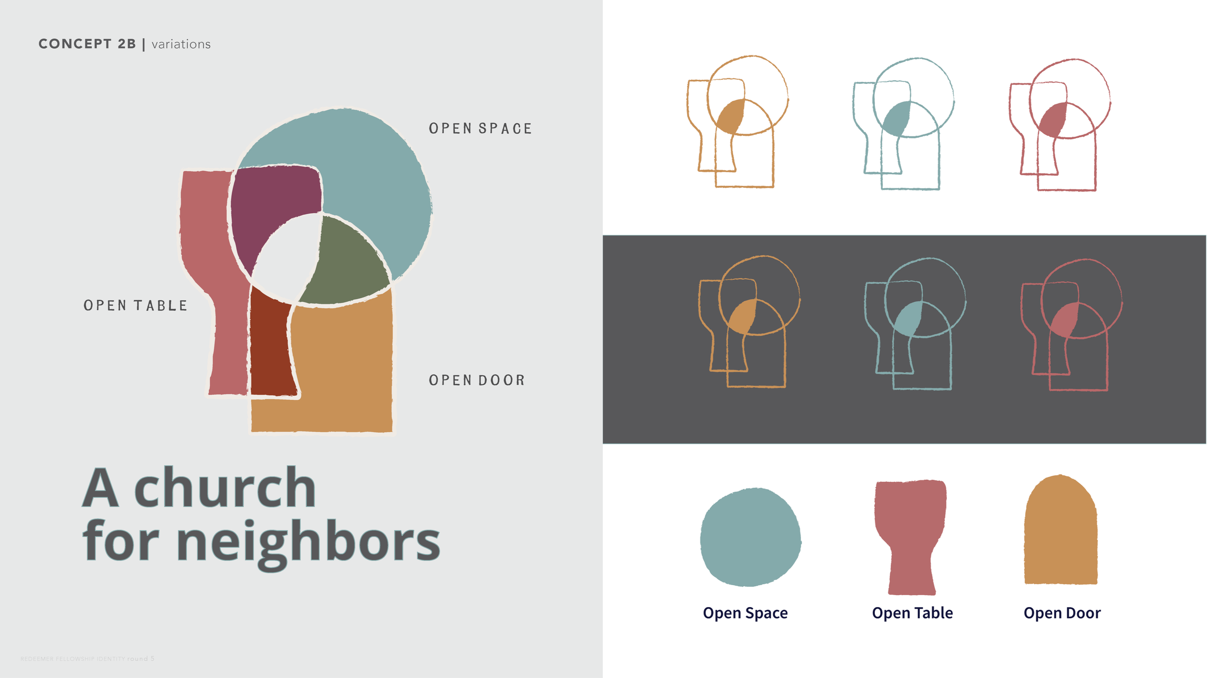
The resulting logo symbolizes belonging—the place where neighbors find Jesus, find each other, and find themselves.
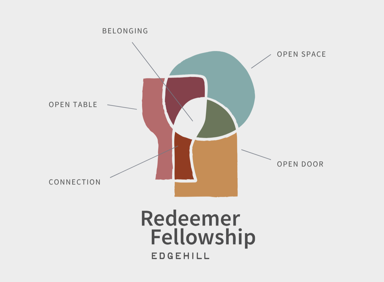
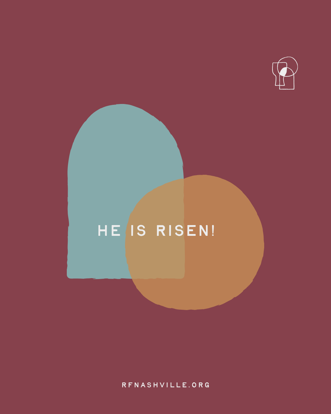
Three meaningful shapes (open table, open space, open door) unite to create a central focal point not unlike a neighborhood map. The abstracted shapes are intentionally imperfect and slightly rough, blending the ancient and the modern.
The overlapping symbols, lines and jewel tones of the mark are also reminiscent of illuminated church windows, conveying a sense of the sacred without overused religious symbolism.
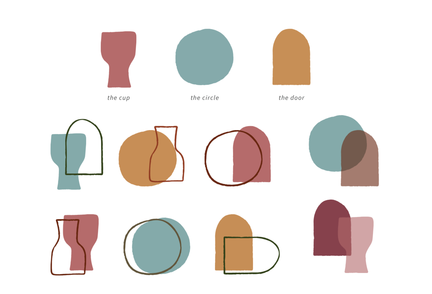

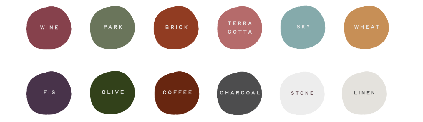
The brand comes to life with clean, approachable typography and colors that are warm, earthy, and drawn from elements of everyday life.
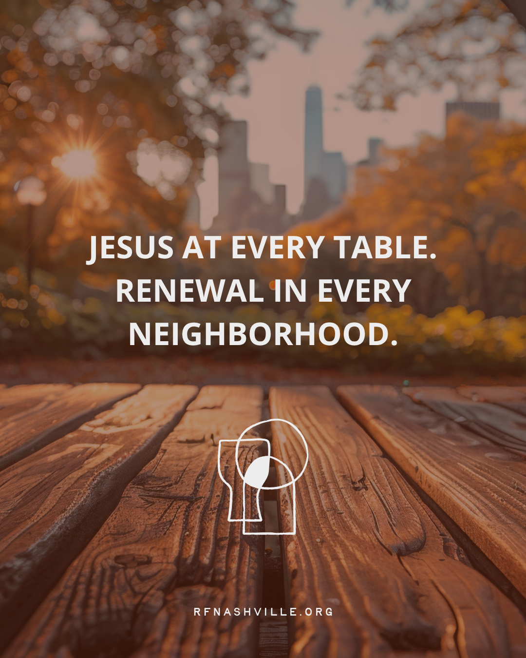
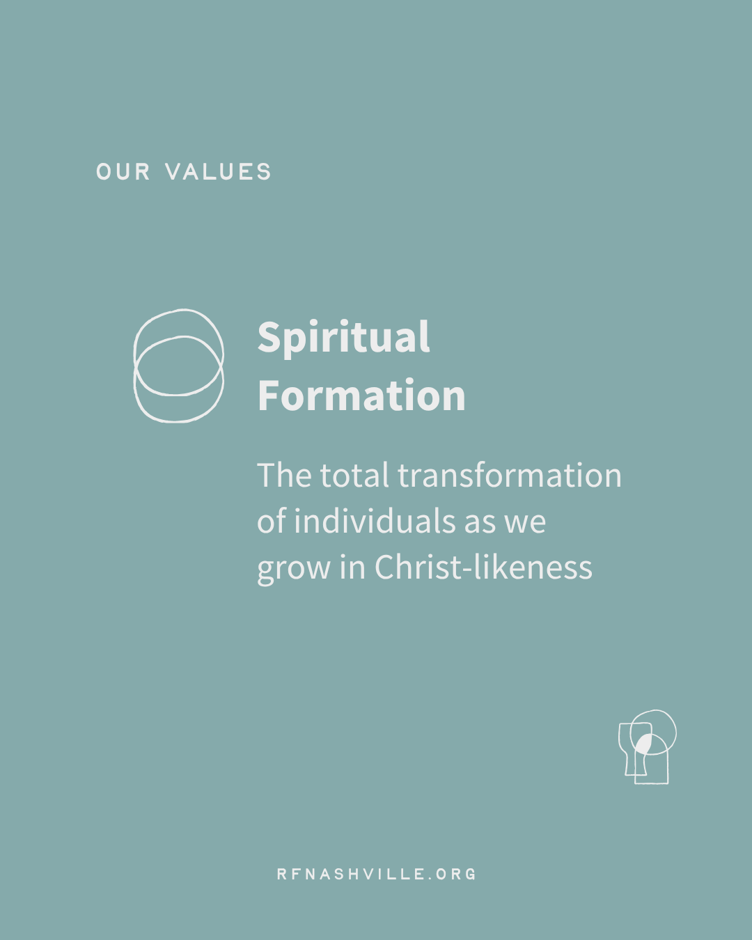
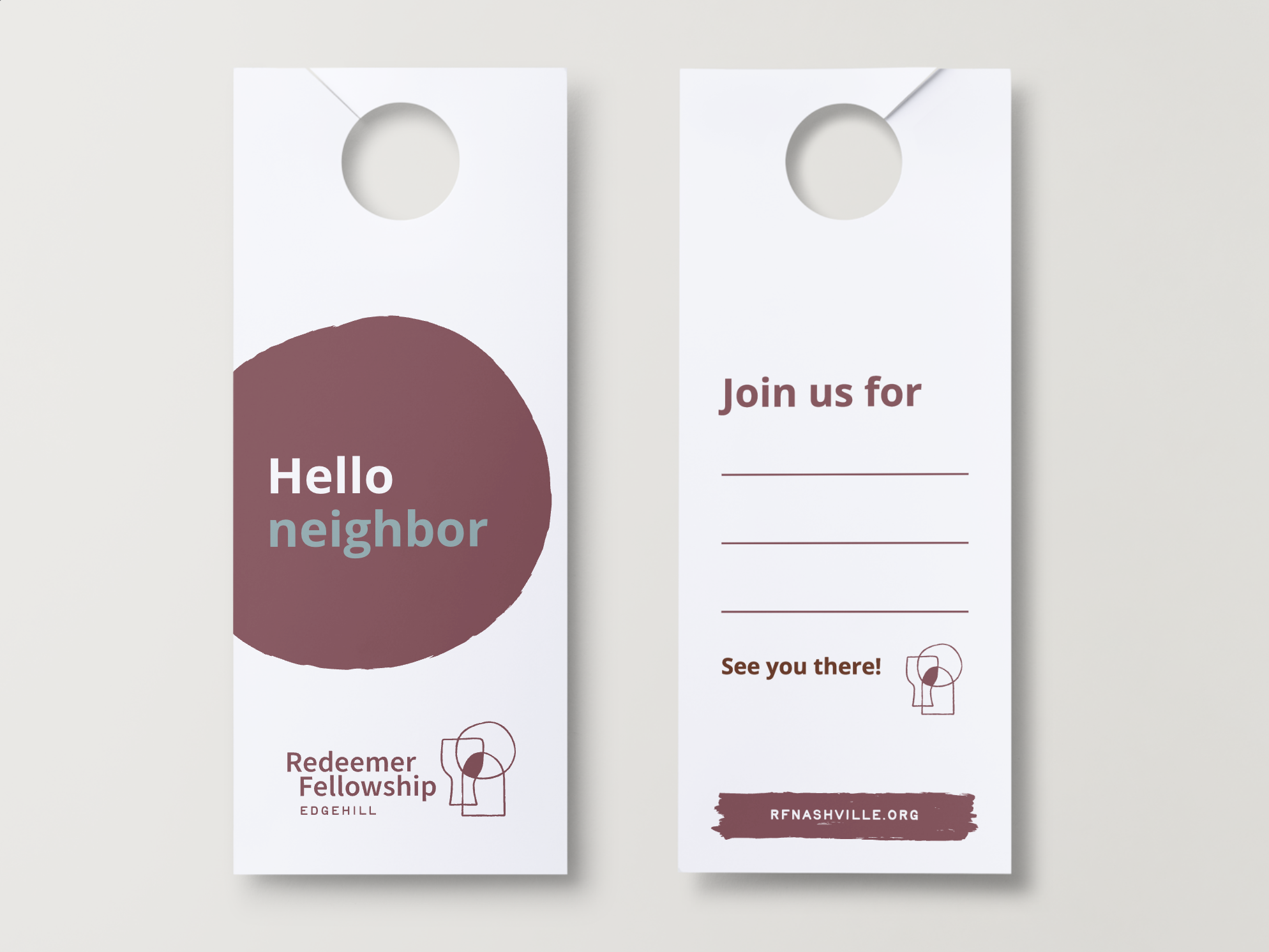
The shapes combine in various ways to create new symbolism and graphic interest across different media and communication channels.